HopStair

CHALLENGE: Design a campaign and uniquely ownable motion identity to launch a daily confidence training app and service that aims to fill the gap in mental wellness between mindfulness and medical treatment.
SOLUTION: A pointed voiceover paired with a bespoke, brush textured, illustration style creates an all-too relatable world in which viewers are invited to follow a character on an epic journey to overcome the daily slow drip of 21st century mental pressures and seize control of their life.
ROLE: Creative Director, Director, Writer
Brand Manifesto
Public Awareness

Design & Development
Leading MOWE’s creative development and execution for HopStair, I was approached with a content strategy calling for three videos that would each serve a unique purpose for the brand and target separate audiences.
Creative Strategy
The campaign required a creative platform—a core idea or north star that could drive our creative decisions—so I began by researching the client, competitors and the mental wellness space. I then used these insights and the discovery already completed by MOWE’s marketing strategy team to developed a conceptual foundation: Unlock Yourself.
HopStair helps you build the confidence to unlock yourself, one step at a time.
Expanding upon the notion of "getting unstuck", and borrowing a page from game narrative design strategy, our creative platform was designed to engage audiences by offering the power to break free of mental constraints, with HopStair as a guide to strengthen confidence and unlock the best version of themselves: the one they always had the potential to become.

Narrative
Once our creative platform was approved, I built a narrative strategy outlining the key elements around which our videos would revolve and the journeys we would take viewers on.
It was essential for the message and the creative platform that we build a sympathetic relationship with the audience to maximize the personal impact of each video. Playing to the common denominator of daily mental wellness struggles and insecurities driven by the constant demands of 21st century life, I proposed a metaphorical character journey that would reflect a wide range individual experiences.
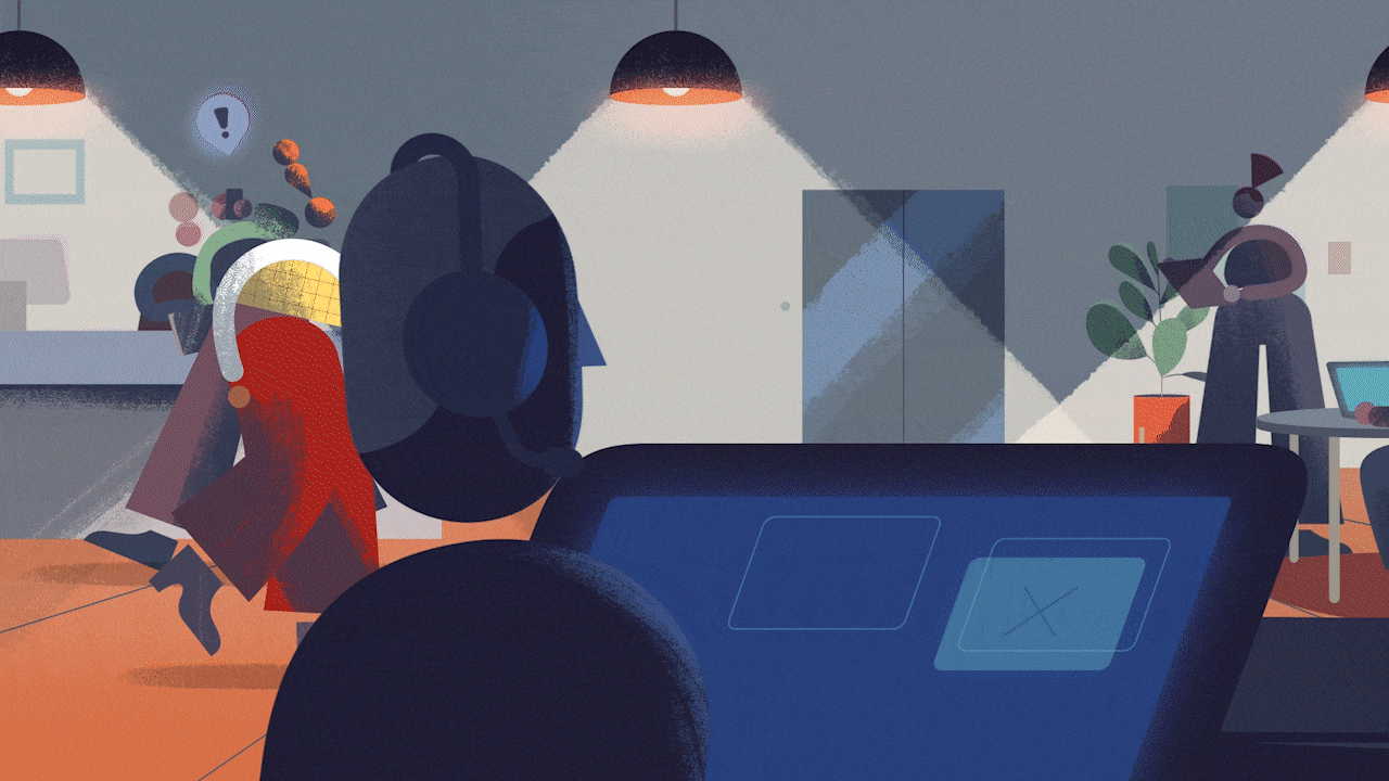
We meet our character in the relatable settings of an office and a commute as the pressures of life quickly weigh upon them. Together, we slide into the abstract darkness of our character’s mind. Yet just as all seems insurmountable, a beam of light arrives, guiding our character to confidently crush their challenges and unlock their potential.
Writing
I wrote three scripts, each employing a slightly different voice that would become more urgent and direct as the target audiences and purpose for each spot narrowed:
A manifesto serves as the introduction to the brand and its mission, taking on a sympathetic voice to reflect the end-user experience.
A public awareness statement confronts viewers, calling attention to a gap in our mental wellness approach, encouraging the institution of confidence as a third form of exercise equal to cardio and resistance training.
An urgent warning that lack of confidence is a global crisis, implores viewers to support HopStair’s confidence training to unlock the world.
Visual Development
With scripts and narrative locked in, we proceeded to design the world of HopStair.
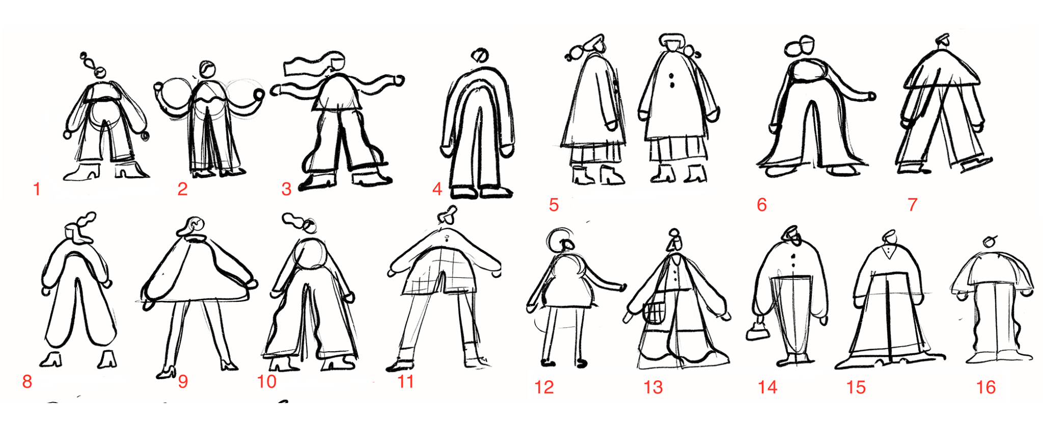
Character
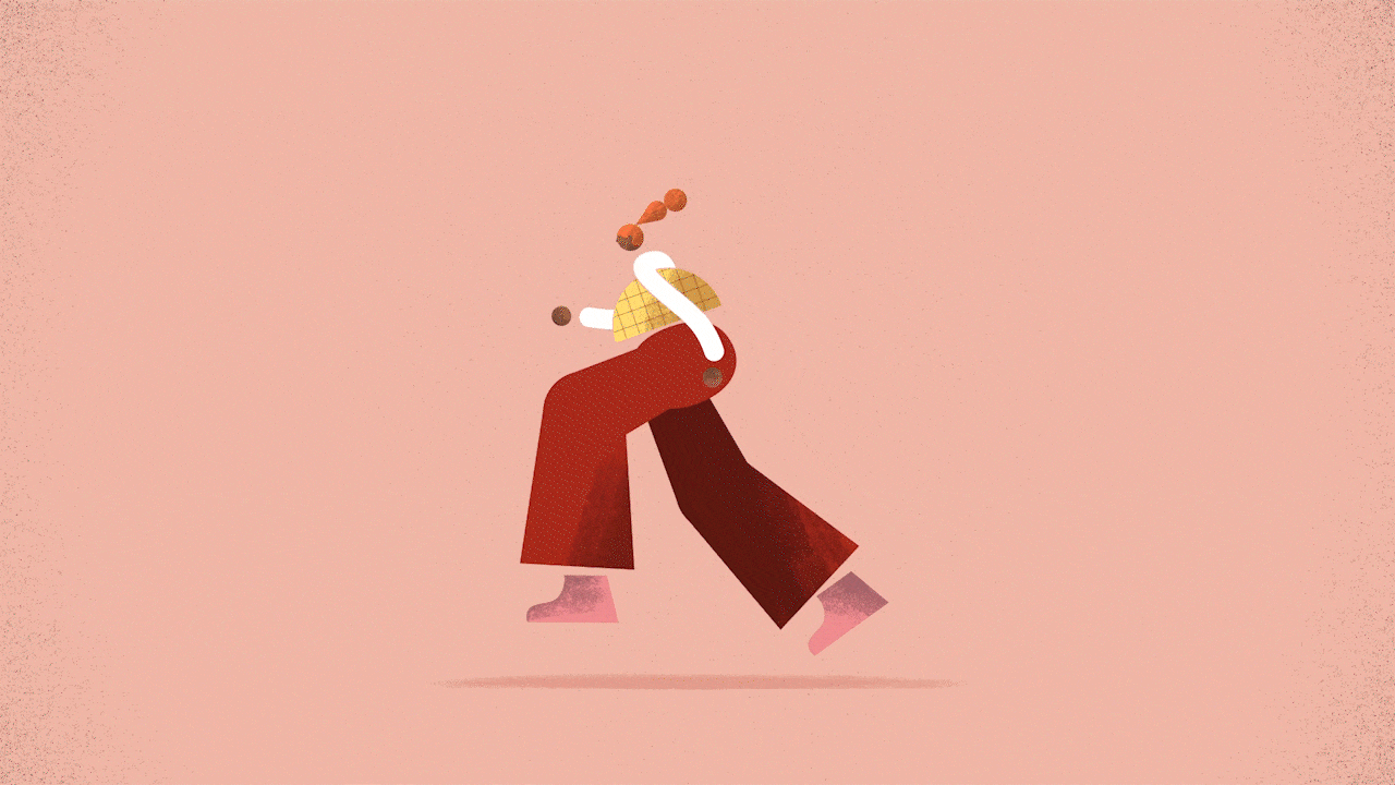
Seeking to create a relatable, yet contemporary, guide that would both disarm the thorny subject of mental wellness and distinguish HopStair from competitors, we explored a variety of abstract minimalist characters designed to be a little bit weird.
Style Frames
With our character locked, we proceeded to iterate on the wider look and feel of the environments and the world that would define our campaign. Drawing on key moments from our narrative, I led the team through sketches, color studies, texture tests, and creating a final style.


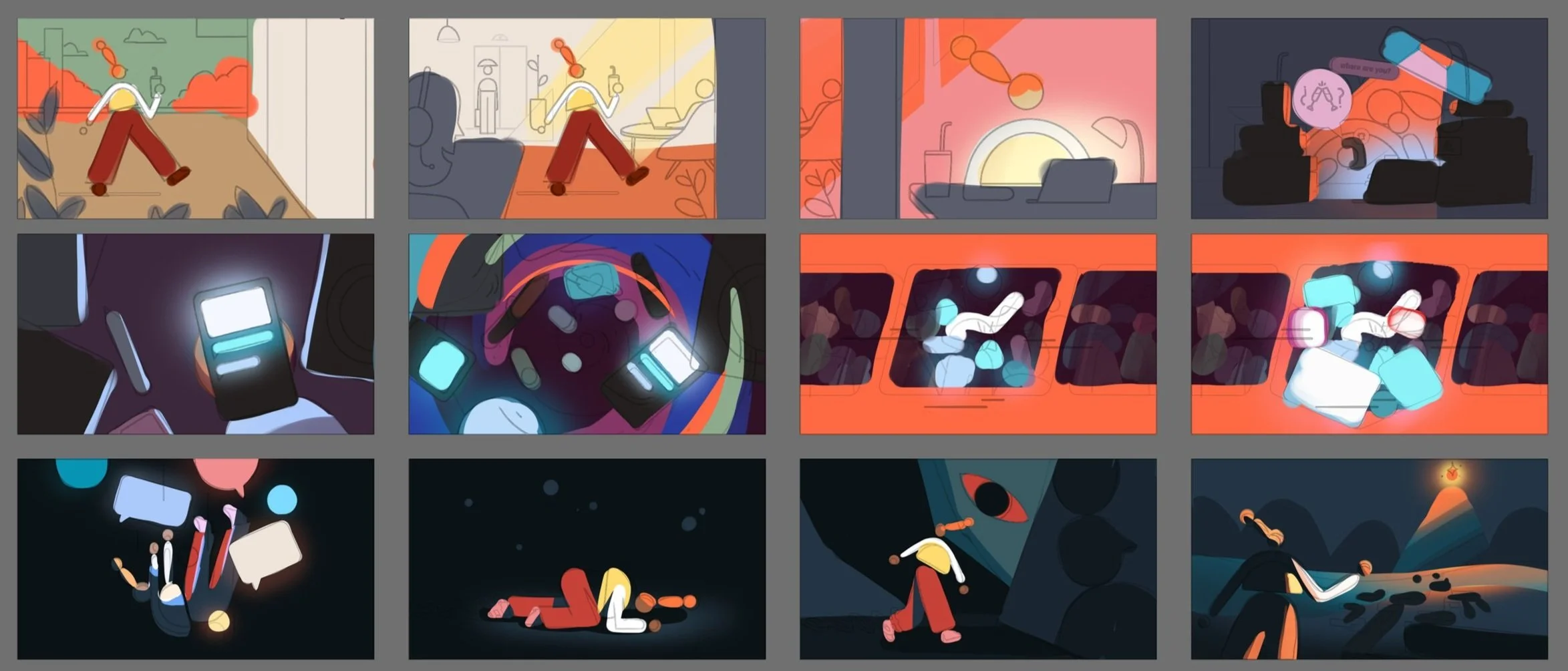
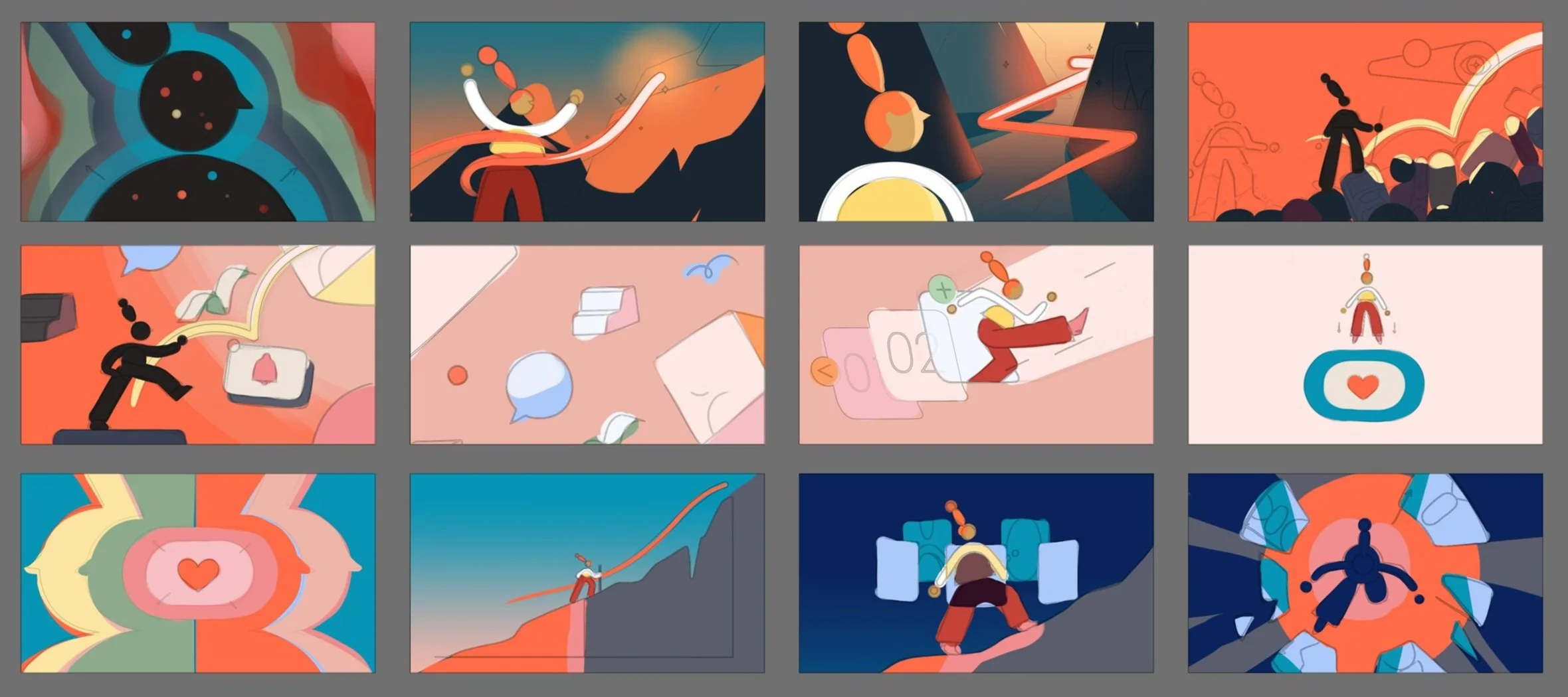
Storyboards
Using the approved style and character design, we moved on to mapping out the visual concepts and progression of our campaign. This is the moment that everything starts coming together as we establish the key frames that serve as the architectural blueprint of an animation. Similar to drafting wireframes in UX design, the storyboard is our opportunity to design the viewer journey and set the pacing of our story to ensure the viewer comes away with the message and the feeling the video is designed to impart.
Given that HopStair was still in start-up mode during our collaboration, and as one of their goals for the campaign was to help raise their next round of funding, we strategically designed the campaign’s three videos to share specific visual elements in order to maximize budget efficiency without sacrificing visual quality, diversity of content, or impact.
Beginning with the Brand Manifesto, I approached the storyboards with an eye for where we could create overlaps, what sections would need to be entirely unique for each video, and where the story demanded that we go big to best allocate our team’s time.


Brand Manifesto
Illustrations
With our storyboards approved, we moved on to illustration, evolving the storyboards into colored vectors, over which we ultimately applied the signature texture and lighting effects that define the style.
Colorscript
Painting in broad swaths, we began our illustration process in the abstract by first exploring and establishing how colors would progress, guide the emotions, and set the tone of each video as our character forged their path through these stories.
Vectors and Textures
Expanding upon the concepts sketched in the storyboards, our illustrators meticulously designed each frame of the animation, collaborating hand-in-hand with the animation team to develop an animation friendly technique for brushing in the lighting and textures our style required,


Animation
With a boundary-pushing illustration style built around flat designs layered over with brushed on textures, cinematic lighting effects, and a quirky, curvy, character structure, bringing the visuals to life posed an assortment of challenges for our animation team. Of course, we had assembled a world-class team that was more than capable of hurdling any obstacles.
Putting heads together with the studio’s Producer and Head of Animation, we developed a plan that would borrow on 3D and live-action VFX workflows to separate movement in a different stage from lighting and textures, returning to composite these elements by hand only after the motion was completed.
The result is a bespoke, hand-crafted, eye-catching campaign that immerses viewers in a world which is at once familiar, yet completely new, seamlessly shifting from flat graphic design to cinematic environments. Charting a path from stress to anxiety to recovery and ultimately confidence, the movement through this journey leaves viewers with a singular message: you too can unlock yourself, with HopStair.